Part 1 Self Evaluation
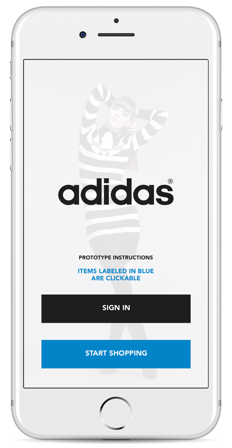
https://marvelapp.com/20e5b90/screen/12901702
1. Overview
• Content: Is everything present that should be included in the design?I think I’ve included all the content, icons links & menus within the Adidas shopping app. I actually studied the Adidas website and various shopping apps to determine which contents are key / important within a shopping app.
• Style: Does the design style seem appropriate for the stated goal or purpose?
I studied Adidas brand book & website to match the app’s look and feel with the brand.
https://issuu.com/janjaneczek/docs/adidas
Also the imagery featured are either from the Adidas website or various clothing images I found online.
2. Analysis
• Layout: Does everything seem to be in the right place?Yes. I based the layout design from various shopping apps best practices / approaches on visual design.
• Flow: Does the content appear in a natural and logical progression?
The flow of the app works well because how I organized the main bottom links to start from home, to clothing departments, look book & account settings. The progression really makes sense once you visit the departments / clothing categories and go through the product navigation process / steps.
• Usability: Is it easy to use or interact with the design solution?
Interacting with the app is very simple & straight forward.
• Typography: Does the type feel appropriate in tone?
I based the typeface of the app from the closest font I found similar to “adiHaus” which is “Tex Gye Adventor” based on online research. The typography hierarchies are appropriate as well from body text to menu links.
• Color: How is color used? What effect does it have in terms of conveying the desired message?
Based the colors on the Adidas brand which are predominantly black, white & grey with a blue accent color to represent a clickable link. I also color corrected the images to match a more sporty, high end look.
• Completeness: Is anything missing? Conversely, is anything there that shouldn’t be?
I tried to feature on the prototype the core features of the shopping app which are the homepage, menus, product list & product details. If I had more time, I would design screens for the checkout process & account logins.
3. Interpretation
• Audience: How do you think the target audience will respond to this solution? Why? Why not? Designed the app based on a flat, modern & minimal look & feel. I think the audience would respond well to the app because of the familiarity of the look and feel. The target audience are mainly teenagers to adults in their 40’s male / female who are active ( sports, fitness ) and urban ( streetwear )• Problem areas: What things in this solution are not as effective as they could be? Why do you think that?
I don’t see any problem areas within my design solution. I really need a more robust user testing of the UI, then learn from feedback the re-iterate.
4. Evaluation
• Judgment: Given the answers to the above, does this design work? What would you do differently or would you revise if you continued to work on this design?I think my approach to the app design works. What I would have done differently is to figure out where to add to the homepage or top notifications button recently viewed items of products to remind users what products they have looked at previously either when they are browsing, or when re-loggeding in.
Part 2 Mobile App Redesign
Name of the app
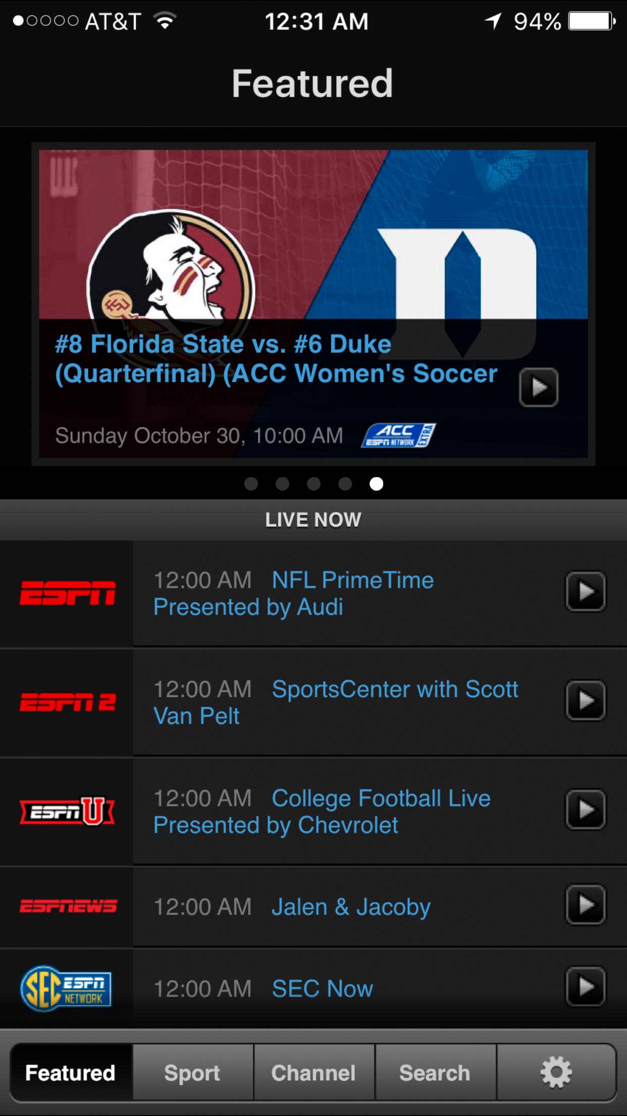
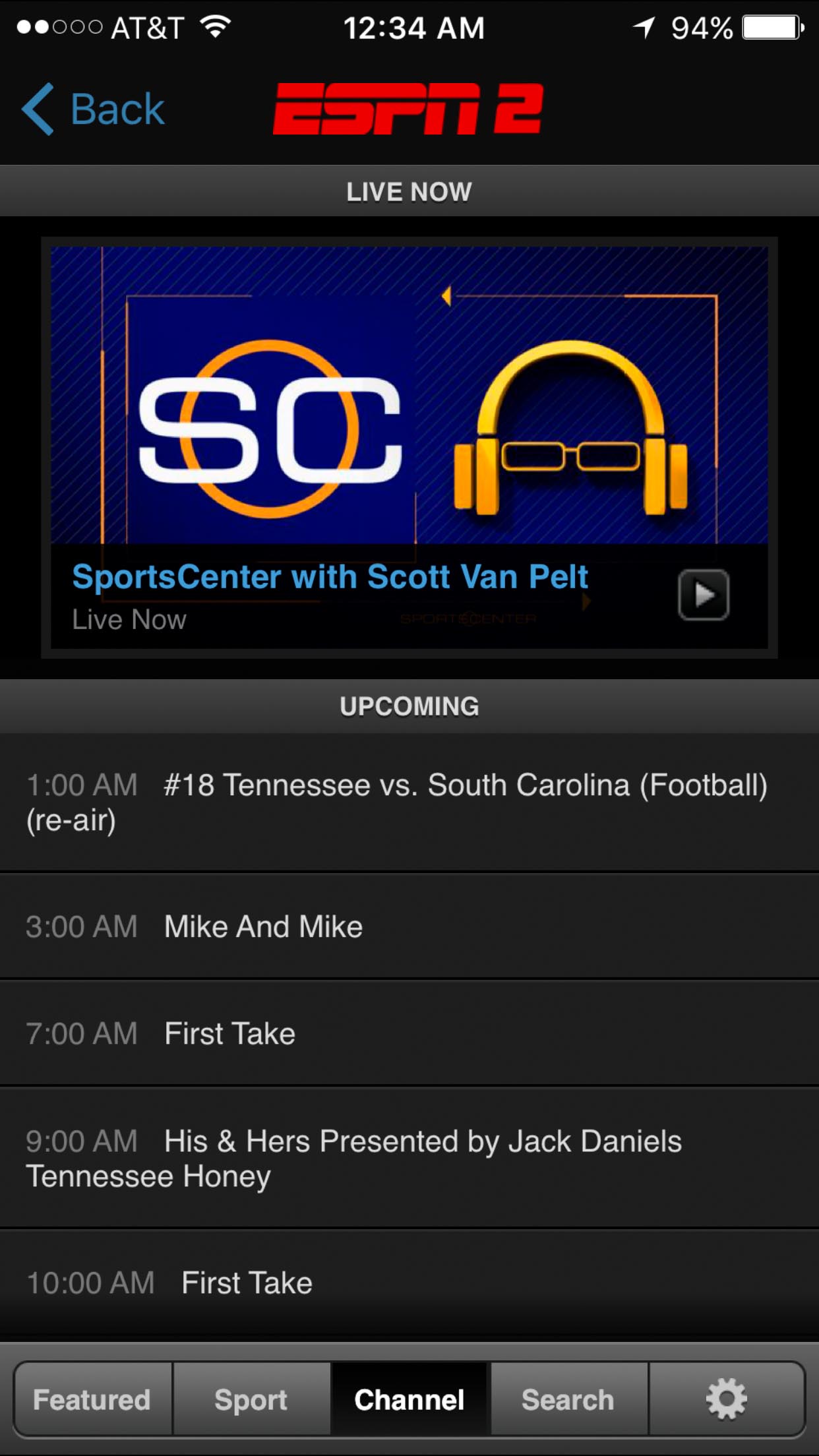
Watch ESPN
Why did you pick this app to redesign?
Was the only app on my iphone that has not been updated recently and the design looks outdated. Also i’m also very passionate about sports and visit & watch ESPN channels / websites on a daily basis.
How have you used it?
Yes, when I’m watching live sports programs on my phone.
What are the app's flaws?
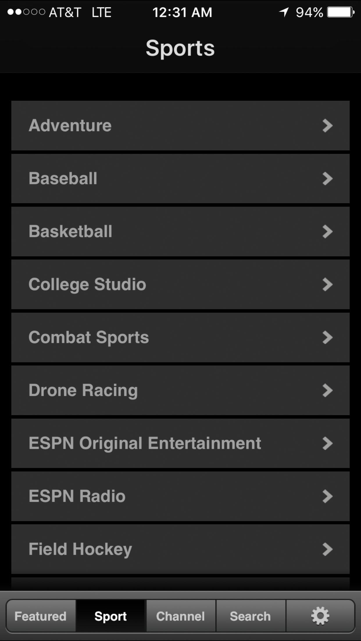
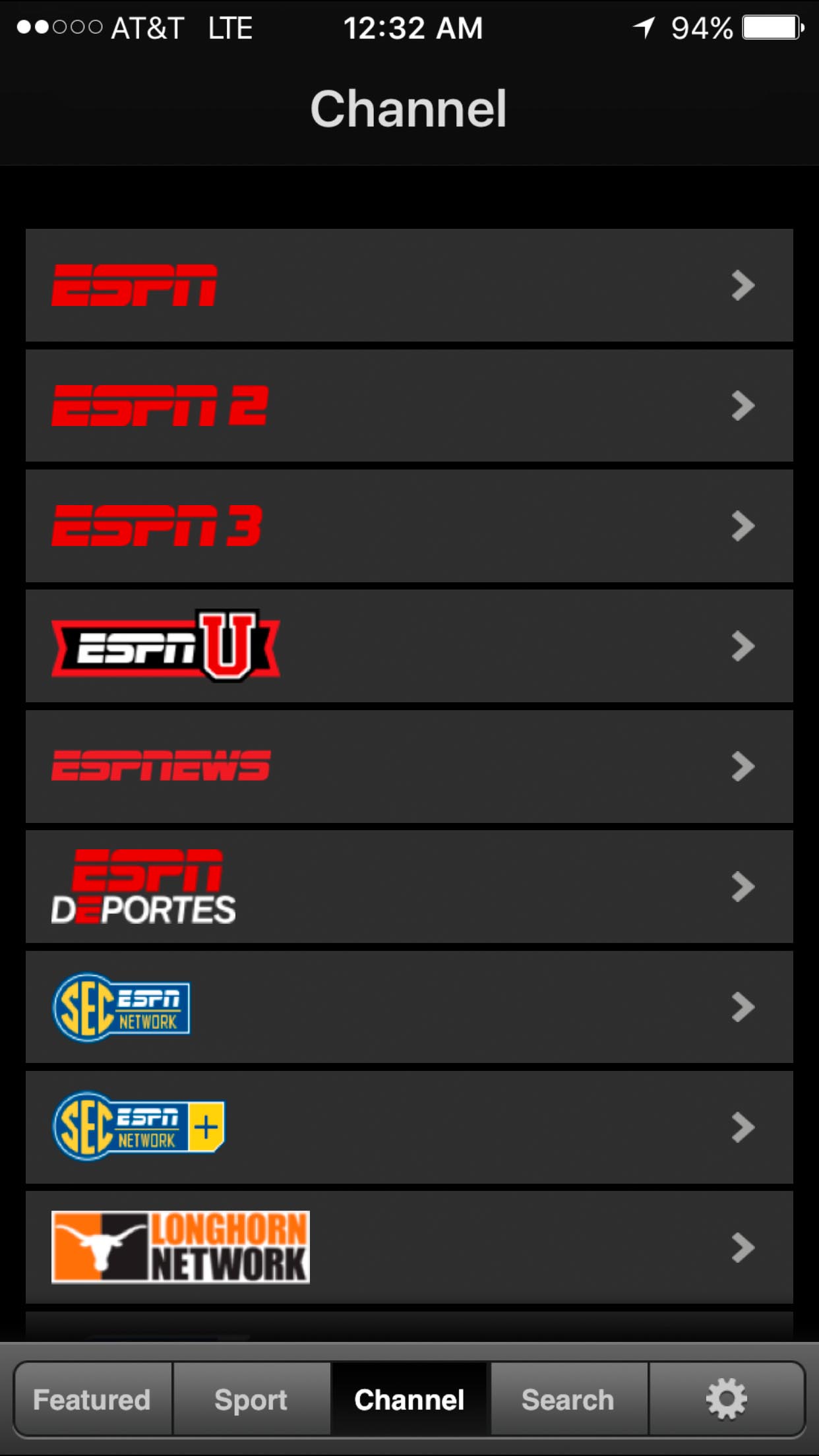
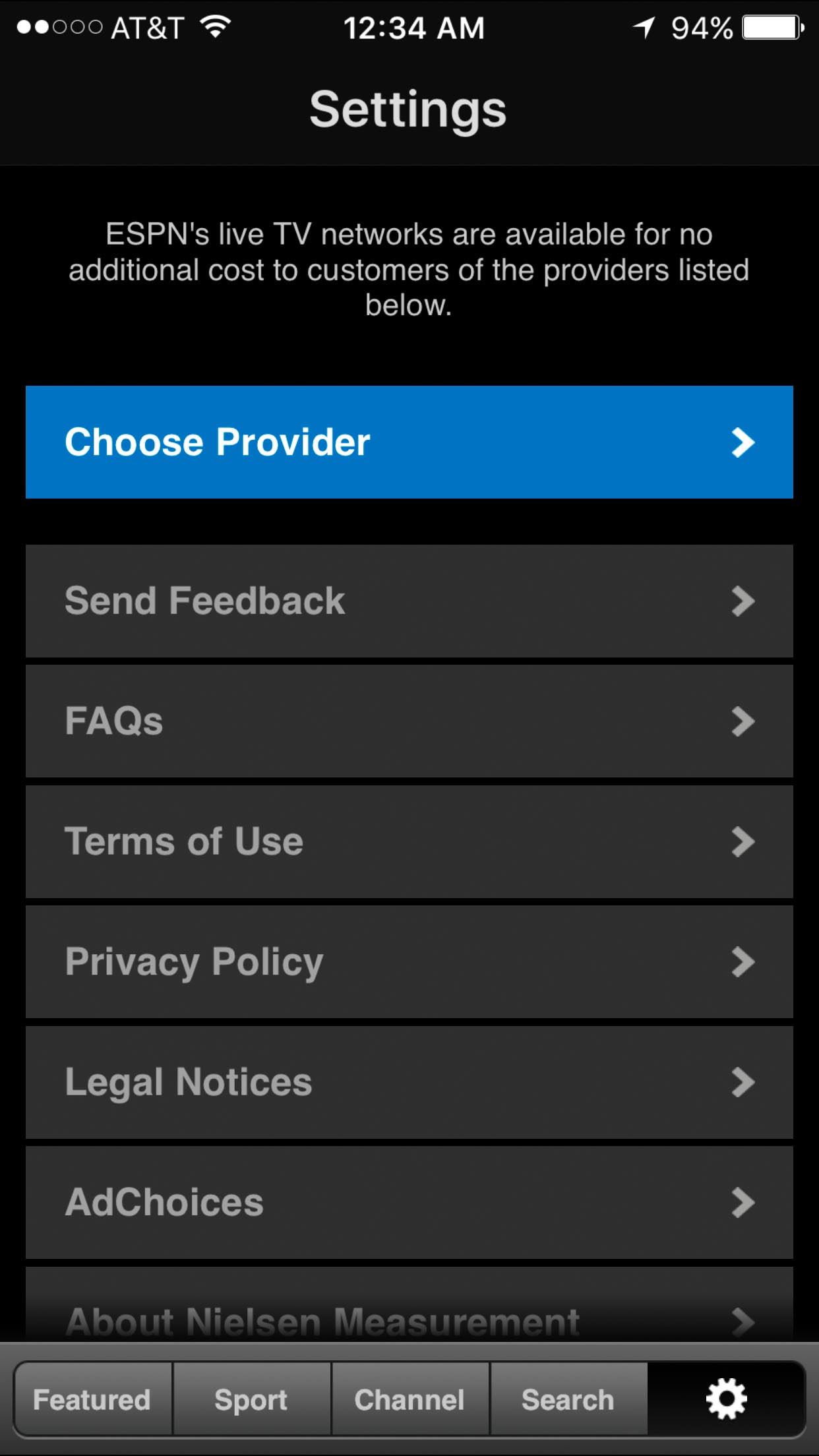
The app’s UI looks very outdated & the dimension seems to be designed for the older iphone 5.
What currently works with the app?
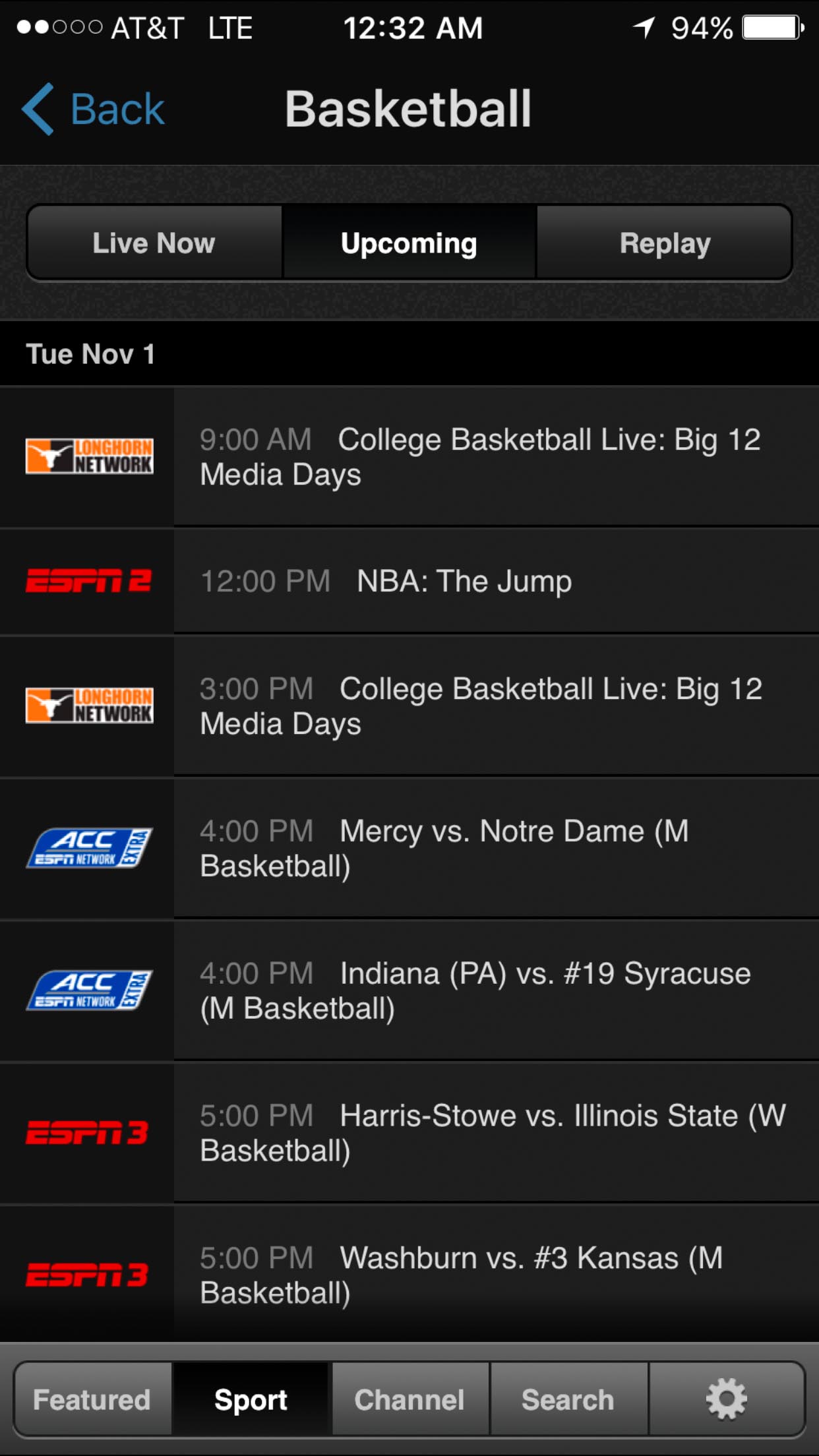
How detailed the list view of upcoming live video schedule.
Who do you think uses the app? (Don't say everyone. Who is the primary audience?) The primary demographics for this app are mostly male 14-60 who want to view live sports program / streaming via a mobile phone or tablet on the go.
What are your goals and objectives for this redesign?
Modernize the UI design and implement a Netflix style content browser.
